
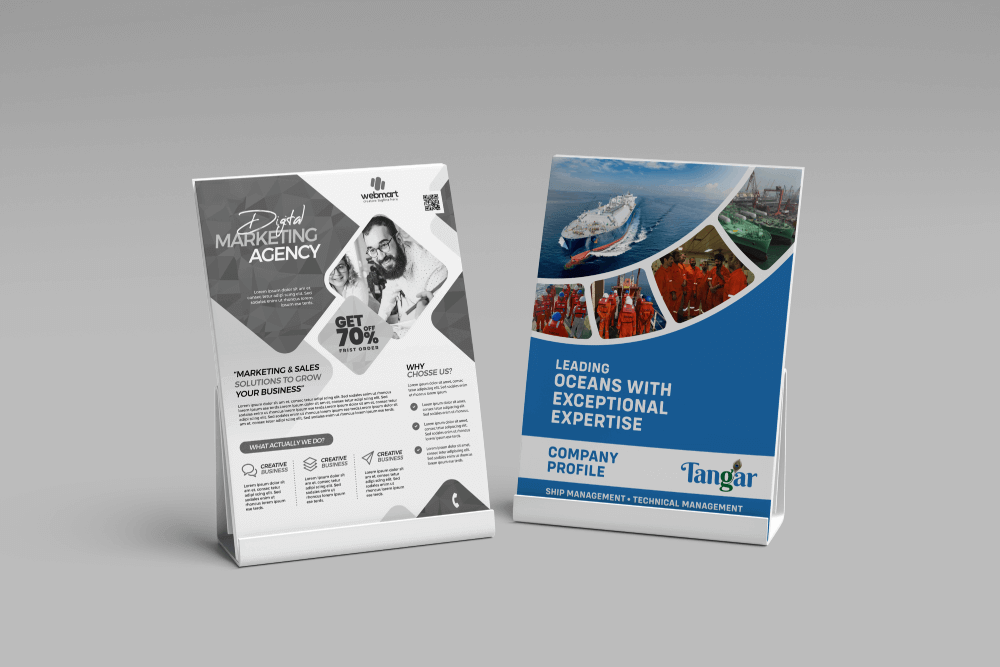
 Generic layouts with no recall
Dense paragraphs that no one reads
Missing narrative flow
Weak CTAs that don't lead anywhere
Because if they don't act after reading it it failed.

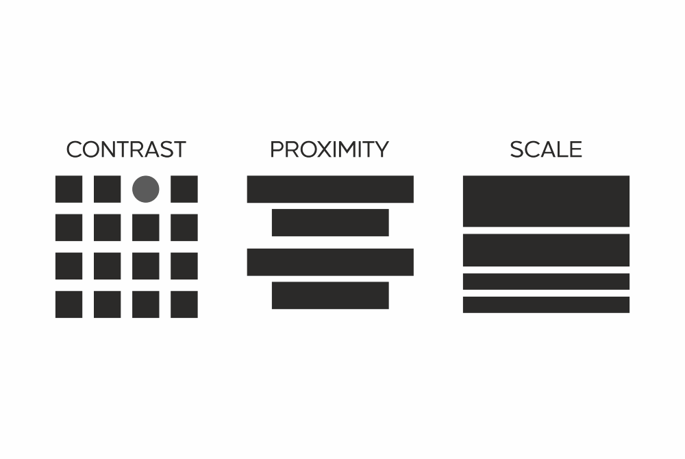
Headline first strategy
Skimmable layouts
CTA design psychology
Balanced visual verbal harmony
A brochure shouldn't explain everything. It should make them want to know more.
So key points are never missed
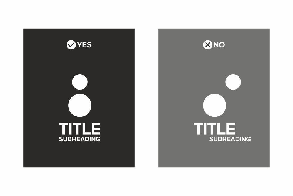
So readers actually finish reading
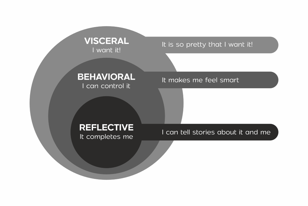
So they remember what they felt, not just what they saw
Book Your Free Print Strategy Session
Let's make brochures and flyers that keep talking even after you're done