Balancing natural care with parent-approved clarity
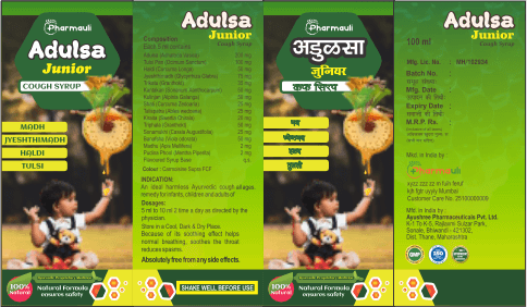
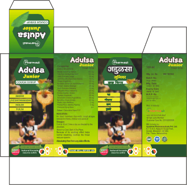
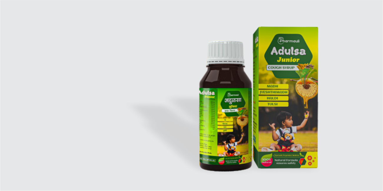
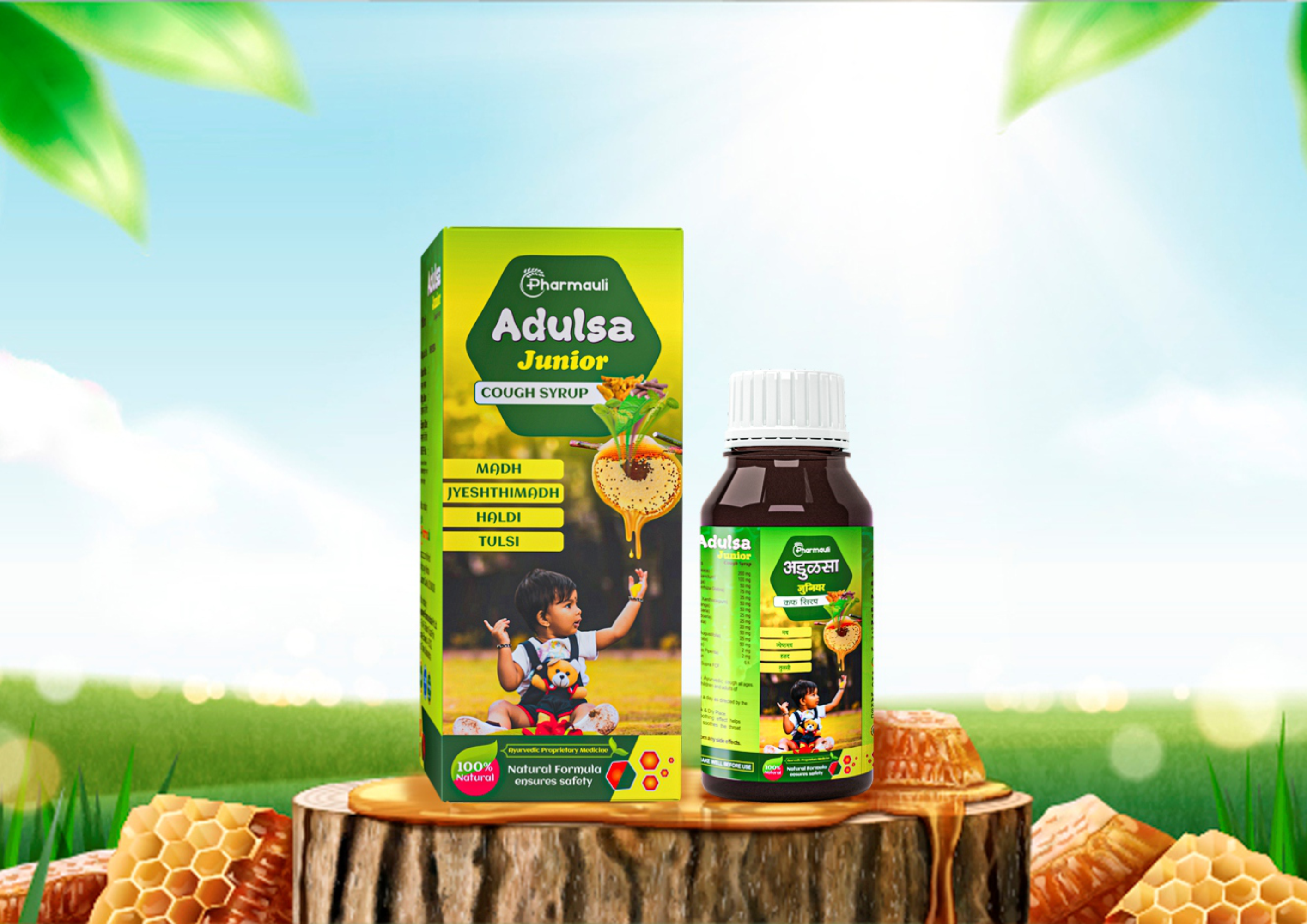
From logo to label, every element of Adulsa Junior was crafted in one place ensuring a consistent, trustworthy identity across the brand. The packaging is carefully designed to reflect Ayurvedic values with a modern approach. Earthy greens and honey tones express natural healing, while visuals of key ingredients like Adulsa, Mulethi, Haldi and Tulsi reinforce authenticity and safety
The cheerful child illustration adds emotional warmth, making it instantly recognizable as a kid focused remedy. Paired with structured information, clear typography, and natural trust marks, the result is a packaging system that not only informs but reassures. A complete branding solution logo and packaging made to stand out for the right reasons.