
A Modern Identity That Reflects Care, Clarity, and Commitment
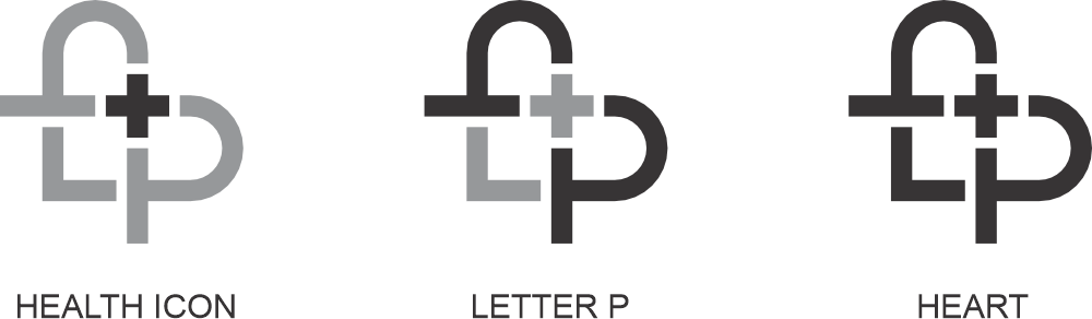
This logo isn't just a graphic it's a carefully constructed expression of what Pulse Hospital stands for. At the heart of the symbol lies a seamless blend of form and function The cross symbolizes health, care, and immediate recognition. The letter P anchors the brand's identity in clarity and confidence. The rounded strokes form a gentle heart, capturing empathy and human connection.
Together, they create a visual that is simple yet deeply meaningful reflecting the hospital's commitment to technology-backed care with a human touch. The navy blue suggests trust, expertise, and dependability, while the red cross brings focus to emergency care and urgency a subtle nod to lives saved through swift, reliable action. This is more than a logo. It's a promise to heal with compassion, lead with innovation and always put patients first.