
Turning Everyday Tableware into an Iconic Brand Mark
Shree Sadguru Krupa needed a logo that felt as familiar and welcoming as the products they make. Known for their paper plates and disposable serveware, they wanted a symbol that would instantly communicate joy, simplicity and connection just like a full plate served with love.
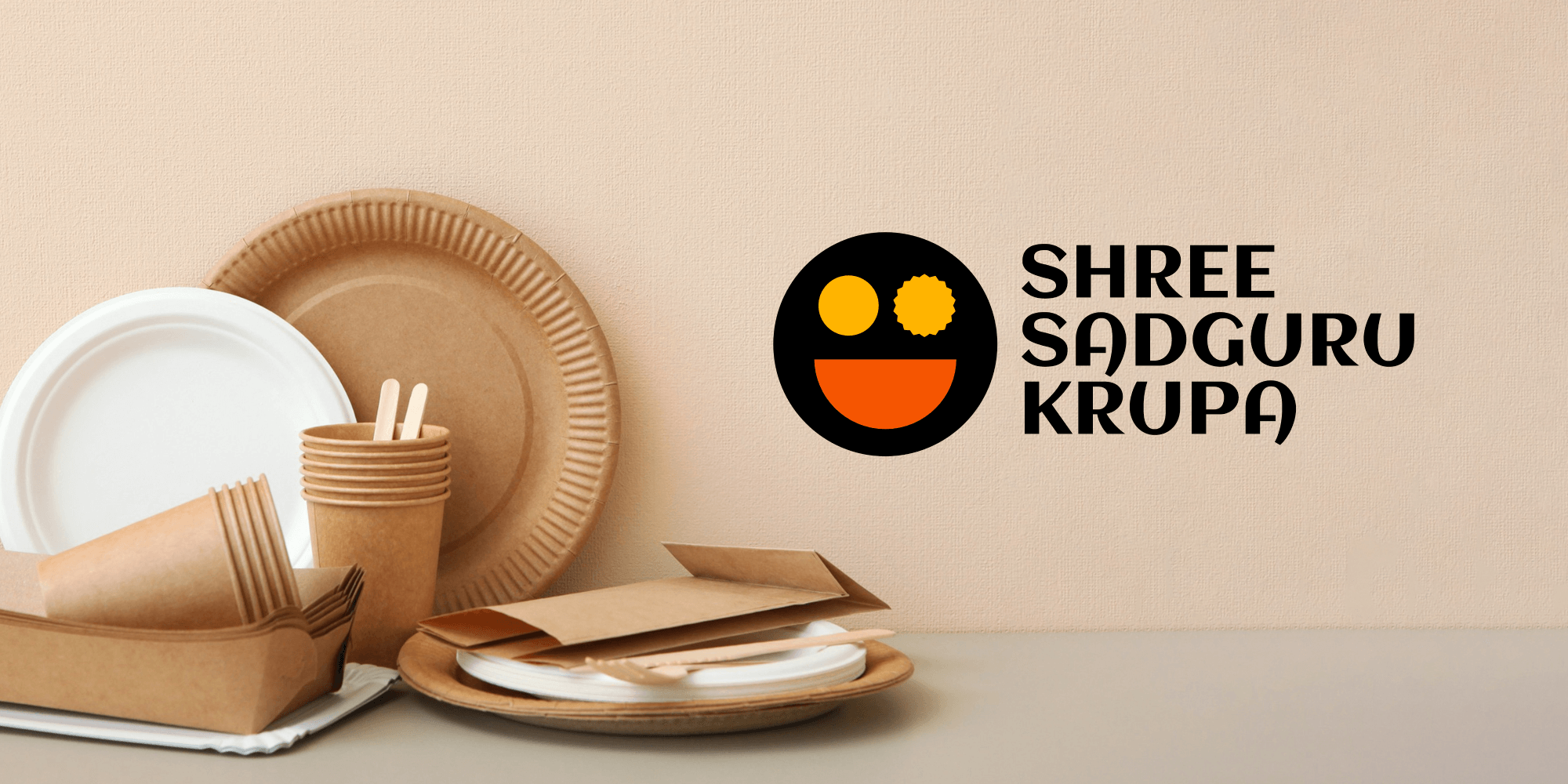
The two yellow elements, inspired by a watti and a papad/katori, reflect both form and function. Together with the wide orange bowl, they bring harmony, happiness, and heritage into a single face like form. It's not just a logo. It's your next meal smiling back.