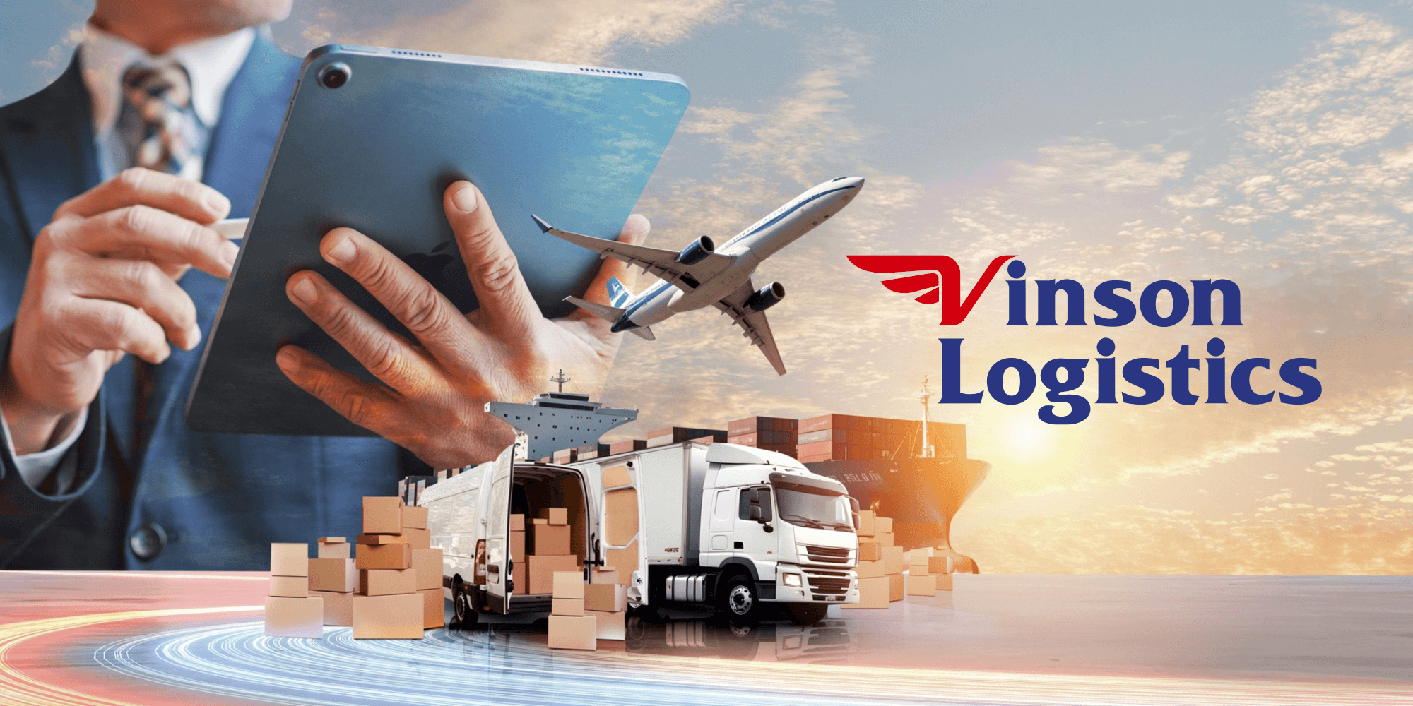
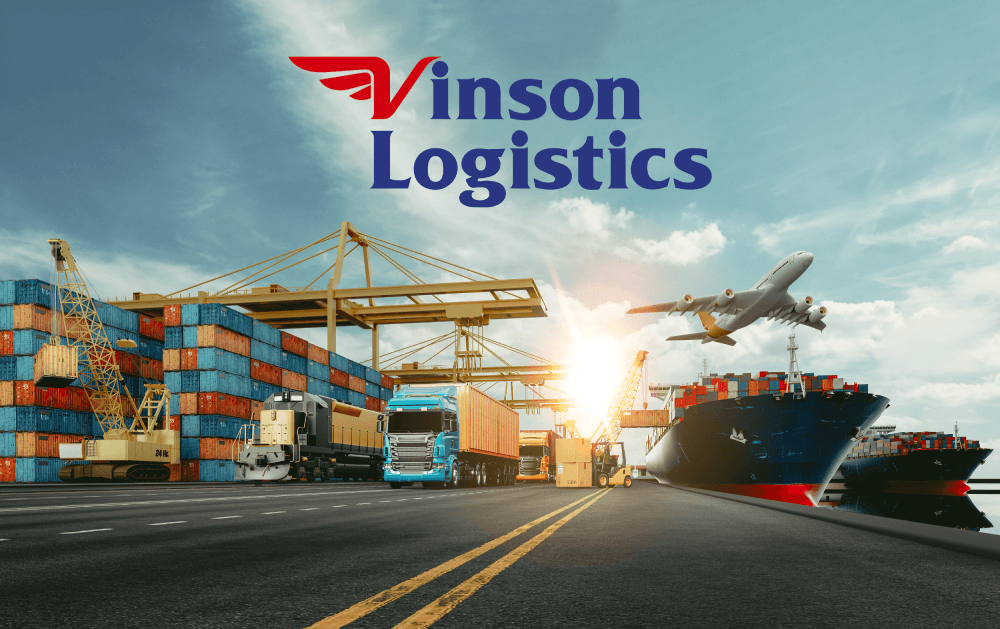
Designing a Logo That Carries More Than Just a Name
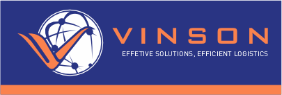
Vinson Logistics needed a brand identity that reflected the scale, speed, and reliability of their logistics operations. Their old logo, with a globe and generic orange typeface, lacked clarity and modern appeal.
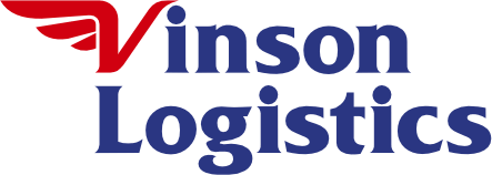
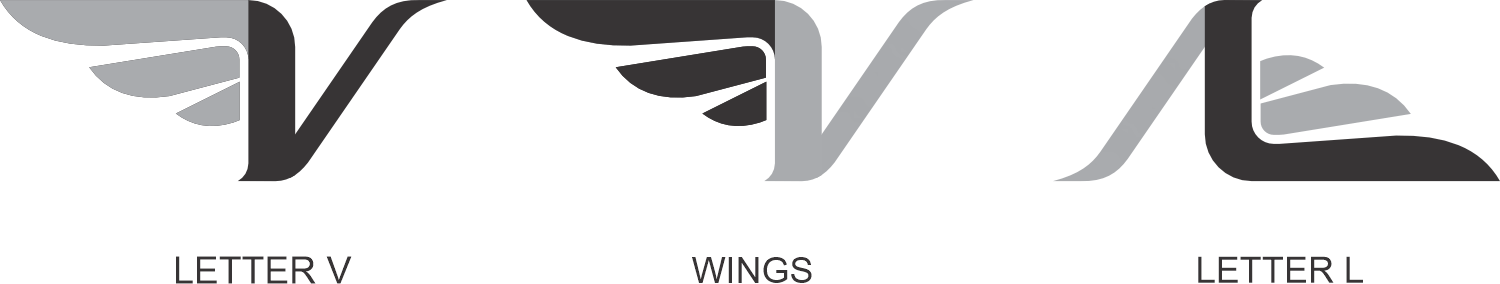
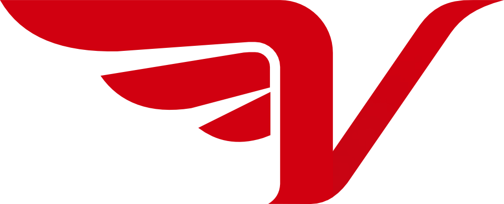
We redesigned it with a bold serif font and a custom wing icon embedded into the "V" symbolizing movement, strength, and global connectivity. The updated name lockup, "Vinson Logistics", brought clarity to their business category and made the brand instantly more professional, memorable and scalable across trucks, signage and digital platforms.